A High Converting Web Design is the key to the success of any small business. You may have a great marketing team, excellent on and off-page search engine optimisation and a beautiful product, but if your web design is poor, it will not lead to conversions and users will leave.
One of the reasons for the success of our small business web design services is our consistent approach to high user conversion. Our aim is to design the kinds of small business websites that users like to visit and that convert well.
More importantly, we work to create the kind of websites that move users to take action.
The goal of any small business website should be to produce a design that is:
- High Converting
- Easy to Navigate
- Interruption Free
- Clearly Branded
- Focused on the Selling Point
While creativity is laudable, if your design does not convert to sales, it needs review and possibly re-design. Work through the list of web design strategies below. Use these design points as a tool to audit your small business web design.
They will not only improve your conversions but will also likely improve or boost your search engine ranking in Google.
1. Have a Clear Value Proposition
Your unique selling point or value proposition is what sets your product or service apart from other small businesses.
Competition in small business online is tough, and you need to articulate exactly what your product or service can achieve for clients and customers.
That value proposition needs to be positioned in a central of within your overall web design. I see many web designers positioning their unique selling proposition in hard-to-find places.
If your prospective client or customer can’t see what it is that sets you apart from the competition, they are not likely to stay on the site for very long and your conversions will quickly drop.
Take FedEx as one example. Their slogan, when it absolutely, positively has to be there overnight, is a classic example of a unique selling point.

When it Absolutely, Positively, has to be there overnight.
In one sentence it tells you exactly what they came to achieve for their customers. This simple phrase can lead to a high-converting audience – all of whom are marked by the need for speed!
Your unique selling point should be front and centre in your web design, and its colour should make it stand out and be easily read.
Value propositions will also vary according to the nature of your industry. Designing a photography or hair salon website involves creativity not usually seen when designing a website for a medical practice.
So, make sure your web design style is consistent with your value proposition and in harmony with your industry.
2. Simplify your Navigation
A high-converting web design should walk your site visitors through to an action you want them to take. That direction may be a telephone call or completing a contact form. It may be sharing your content with other users through social media.
Our research also shows that customers can bypass the navigation almost altogether if the web design implements a chat button – something we found can lift signups by over 30%.
Your site navigation should reflect your intentions. Your web design should make it easy for people to navigate the site in the least amount of clicks possible to gain the highest conversions.
Navigation tips from the best web design companies in Canada:
- Use sticky menu
- Label your menus
- Have a search bar
- Keep your users in mind. You are designing for them!
Keep your navigation labels and heading easy to understand. Your web design should not be cryptic or create a challenge for site visitors.
Take time to review the web designs navigation and make sure that it is simple, clear and accurate.
Follow Hicks Law. Hicks Law is the idea that the more choices you give, the longer the reaction time – and subsequently the more likely people are to become indecisive.
3. Use a Predictable Layout
While there may be some prizes for creative web designers among web designers, in the main, you need to provide a predictable layout for your small business website to convert at a reasonable rate.
One way you can ensure this predictable and simple out is to look at other businesses in your niche.
How To Choose The Best Web Design For Your Website
When you’re choosing a website design, one of the first things that should concern you is the type of design. Will it be a Flash design or will it be a more traditional HTML design? It’s also important to decide how many pages you want and what sort of navigation will be used.
Once you’ve decided what kind of web design you want, there are a few things you’ll need to consider, including the following:
- Bandwidth And Space Required: The first is the amount of bandwidth and space needed. This is important because you don’t want to pay for too much bandwidth, and you also don’t want your website to take up too much space in your browser.
- Color Scheme: The next thing to consider is the color scheme of your website design. Many web designers these days prefer to use one solid color for their website design. While this is a common design, there are also websites that’ll use multiple colors to create a more interesting design.
- Template: When choosing the template, you need to make sure that it’ll load fast. Some people even opt to add other scripts to the page to make it more interactive and functional, but this isn’t always a good idea. You also need to make sure that the code used is SEO friendly. Otherwise, the page will really be penalized by Google.
- Plugins: Several different types of plugins are available for you to use in order to improve your website’s functionality. These plugins can help your website to load faster and to help your website rank higher in search engine results.
- Features: When looking for a web design, it’s important to consider what features you want your page to have. This is where talking to a professional about the different features that you might want on your website can be helpful.
Here are some cool styling ideas from the people over at Devrix.
Phone numbers are typically found in the right top corner while logos the top left. Calls to action should be front, and centre and services should be laid out horizontally.
Don’t be fooled by the bells, toys, gimmicks and whistles that many web designers try to overload your site with. Remember, the goal is to boost conversions, which means a simple, clean web design.
There are some exceptional examples of designs that I deliberately cluttered with every manner of widget and gadget.

These sites work because their brand has developed a reputation for eccentricity.
My advice to you is not to go after eccentricity. If you want to be seen as a serious business online, then publish serious-looking web design that is simple and easy in its layout.
Most people who are seeking a product or service online I’m not looking to be amused or distracted.
So remove all distractions from your web design and layout so that nothing gets in the way of a good conversion.
Your design should focus on usability and clarity. Your task is to remove all forms of doubt and scepticism and present yourself as an authority in your industry.
Your web design is the number one way you’re going to achieve that brand recognition and encourage the trust needed.
4. Ensure Consistent Branding
Along with layout and design comes consistent branding. Make sure your logos of the same style colour and design for every page of your website.
While branding begins with things like logos and slogans it goes well beyond that when it comes to web design and high conversions.
“It takes the average person 0.05 seconds to make a judgement about your website”, says Web Hosting Secrets Revealed. “That translates to 50 milliseconds to make a good first impression on your visitor.”
If that’s the case, then chances are they are not judging you on the bulk of your text: They are judging you on images, layout and titles.
So, make sure these three things – Images, Layout and Titles – are consistently branded in order to minimise jolting and confusion for your readers.
Consistent branding means the consistent use of colour, fonts, image Styles and which media across the entire design of the site.
This ties in with your layout and the need to be predictable.
For example, with Items that are repeated on your site such as contact forms and calls to action, make sure that these are roughly in the same position on every page in which they appear.
Ordinarily, if not to your advantage to have the contact form on the left on one page and then the bottom right of the next.
The same would be true for your phone number and other critical information that is embedded in your web design
5. Reduce User Clicks
Good web design is a design that enables users to get information in the shortest number of steps possible.
Avoid pop-ups and other interruptions that are only going to increase the number of clicks a user has to make in order to reach the product or service they are looking for.
This ties into the navigation as well as the web design. People are by nature lazy.
If then else is sitting on the right-hand side of the page for most of the click action on your website, then this is the place to put your call to action.

If your web design courses their mouths to be on the left-hand side, then this is where your most important information and clickable content needs to be.
This applies to e-commerce web design as well. The Checkout Process is not the time to start asking extraneous, additional questions.
Save that for after the purchase. Your job in web design is to get them through the check out as quickly and easily as possible with a minimum number of clicks and distractions.
Go ahead and count the number of clicks it takes a user to reach the action service or product you want them to take. Ask the question, “How can these clips be reduced?”
6. Magnify your Call to Action
I have mentioned the importance of a call to action already, but it bears repeating. Your call to action should stand out through the use of colour and position.
It should also stand out regarding the words you choose to use and designed to convert the user by meeting his needs.
The most effective calls to action are typically in the middle of the page with the button to the centre or left of the surrounding content.
Pay attention to the number of calls to action on every page.

The effectiveness of all high converting calls to action will be reduced according to the number of call to action on any one page. Ideally, you only want one call to action per page.
Even if your page contains more than one call to action, the web design should be such that the most important step is the most obvious.
It is also important to ensure that the call to action is relevant to the content on the page. Otherwise, the call to action will simply be seen as any other advert, and it will be ignored.
7. Minimise User Input
Related to the number of clicks a user must take to reach the destination Minimising user input in forms is imperative. Nobody wants to fill out a 10-page form on a website.
Ask yourself how important information you are asking for is in order to gain the lead and make contact with the site user.
Also be sure that your web design, especially the design of your web forms, uses plain English and is not complicated in its layout and design.
The design of your forms should be simple and logical. Take time to design and reconsider the forms on your website. If necessary, do some split testing to compare your conversion rates.
The design of any form that will boost conversions is one that is simple and only asks the necessary questions.
8. Use Fewer but Larger Images
A picture tells a thousand words. Most research suggests that larger pictures lead to higher conversions than smaller images.
Images are relevant to the content on the page and that they clearly portray the message of your brand.

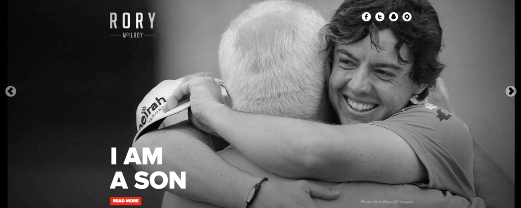
Good web design will typically use the same style of imagery across the site. In other words, if you’re branding uses black and white images then they should be used consistently across the site.
If your web design incorporates Nordic or grunge themes, then they should be the flavour, colouring and style of all of your images.
They should fit congruently into the overall web design for your small business.
As a general rule, it is better to use one or two large images than an abundance of small, hard to view images. Like words, the more images you use the more complex the information will be.
And your job is to simplify the information with clear, large and simple imagery.
9. Ensure Colour Co-ordination
The psychology of colour is a well-studied field. Web design is at it’s best when you take into consideration the colours we are using to communicate our brand message and unique selling proposition.
While many studies have shown an increase in conversions using certain colours, the most important factor is consistency.
This means that the colours and Styles used for anyone product should be used consistently every time that product is mentioned or every time that calls to action is used.
As we said earlier, the goal is predictability and pattern recognition.

Shoppers and those looking for your product and service move quickly across the Internet. They move quickly across your pages and will typically only view the headings and the major calls to action.
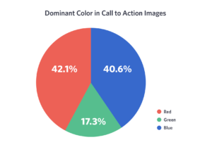
Colour is your best friend in web design. By using consistent colours in, for example, your buttons, the message behind the button becomes clear, and the user is more likely to click.
The more they click, the higher your conversions will be.
Familiarity and pattern recognition should be your goal when it comes to colour choices in web design.
As a general rule three colours work best with one colour dedicated to a call to actions or buttons.
10. Stay Mobile and Responsive
For your web design to truly boost conversion, it needs to be consistent across all devices.
While the amount and type of information on a small device may differ from a laptop or large monitor, the principle of mobile responsive and mobile-friendly website cannot be overstated.
If your design does not incorporate and consider mobile and tablet users, you will quickly lose market share.
Use either HTML5 or other similar coding technology compliant themes and web design platforms. Your web design should look crisp and clear, and your unique selling proposition readily understood from a mobile device, smartphone, iPhone, tablet or desktop computer. If you have the budget you can also create an app but this doesn’t mean that your website shouldn’t be mobile-friendly.
WordPress is exceptional in this regard. Most modern WordPress web design and themes are mobile responsive and look great on any device.
Conclusion
Remember, your goal is to increase conversions, sales and contact your prospective clients and customers.
Take time to go through these design tips and tricks in water to decide what web design is needed in order to engage your target market.
Be prepared to do split testing and experiment with design and web design layout that I go to be most useful in your niche and which are the best converting designs.
Be ready to look at other competitors in your small business industry.
Make a note of what is working for them and consider the ways you can adopt their initiatives and web design principles.
Further reading: Architect website design: 20 Architecture websites


Manoj says
A simple, attractive layout is essential for any website. It should be light weighted and consume less space on the server. I agree with you. These tips are useful for beginners.
Have a nice day.
Take care,